Visualize Scenarios to 2 degrees: IEA Releases New Tool
By
Ellie Johnston
July 10, 2012
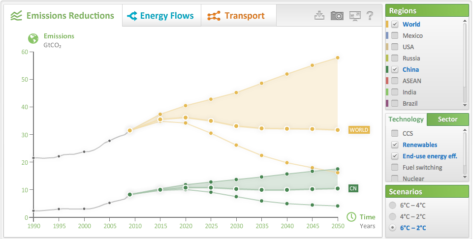
 The International Energy Agency (IEA) has just put up a great interactive tool which enables people to explore the different elements of three energy scenarios, which lead to 2ºC, 4ºC, and 6ºC temperature change by 2100. The tool provides a great interface for users to navigate through animated data visualization found on three different screens exploring emissions reductions, flows of energy, and the transport sector of the different scenarios.
In the Emissions Reductions screen you can examine the contribution that different technologies and sectors have in lowering our emissions, as well as the changes that would mean for nine different subregions. The Energy Flows and Transport figures provide a further array of options to drill down into specific areas of the IEA’s scenarios. This is coupled with the handy abilities to download the data, take a screenshot of the variables you are examining, and go to a full screen view.
The data from this tool comes from the IEA’s recently released ”Energy Technology Perspectives 2012: Pathways to a Clean Energy System,” which goes into much more detail about the opportunities and barriers to follow the most ambitious scenarios. In this age of great information accessibility it is tools like this, and ours, that will help people distill what they need to make the best decisions for them.

